
About me
I focus on turning ideas into clear brand systems that people actually remember and recognize. Every project starts with understanding the “why” behind a business, then shaping how that story shows up visually, verbally, and emotionally across every touchpoint. I pay close attention to consistency, ensuring that every detail supports a unified perception of the brand. My goal is to create identities that attract attention and hold it over time.


Recent projects:
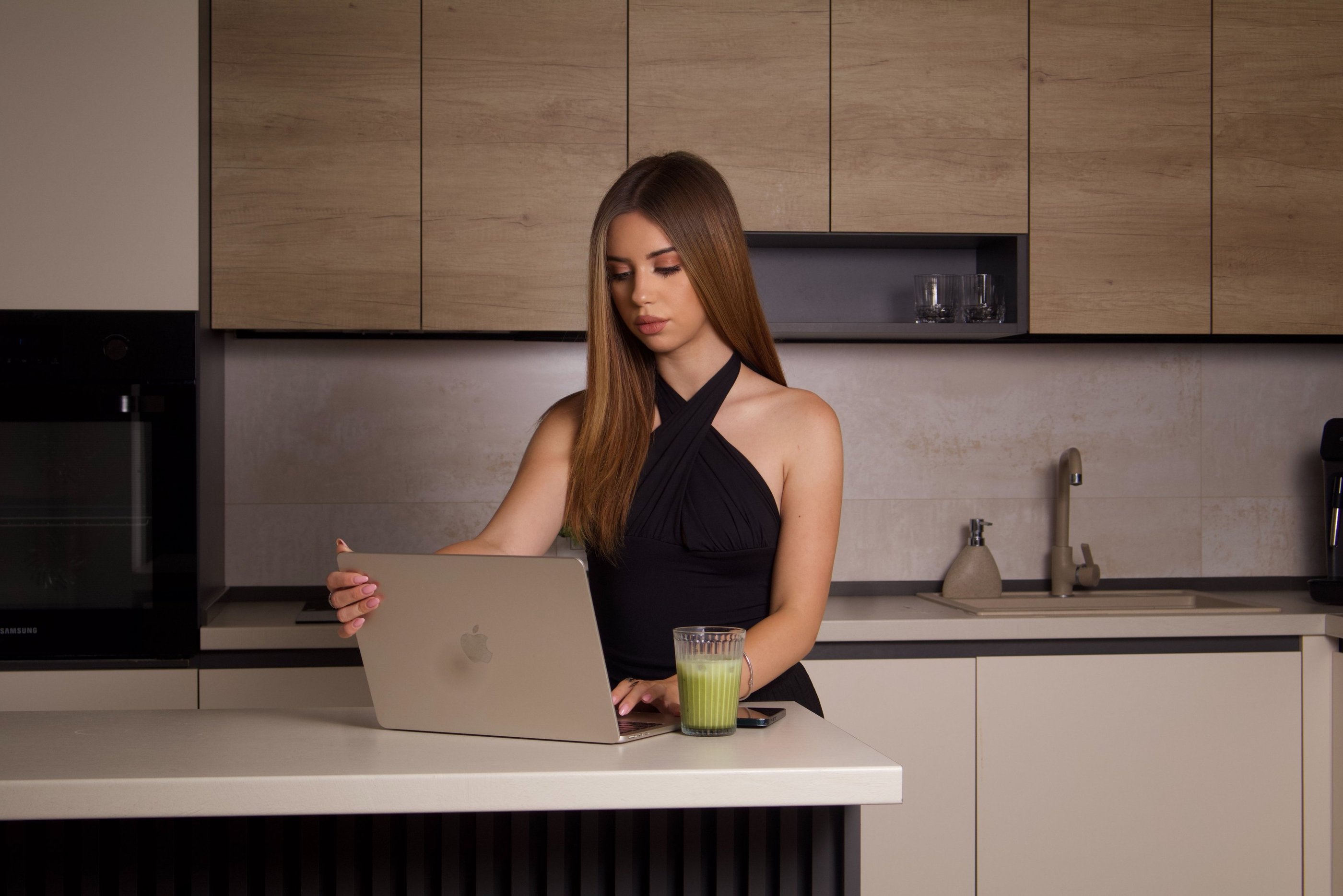
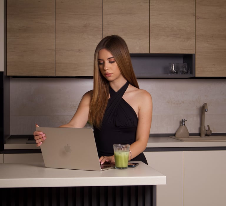
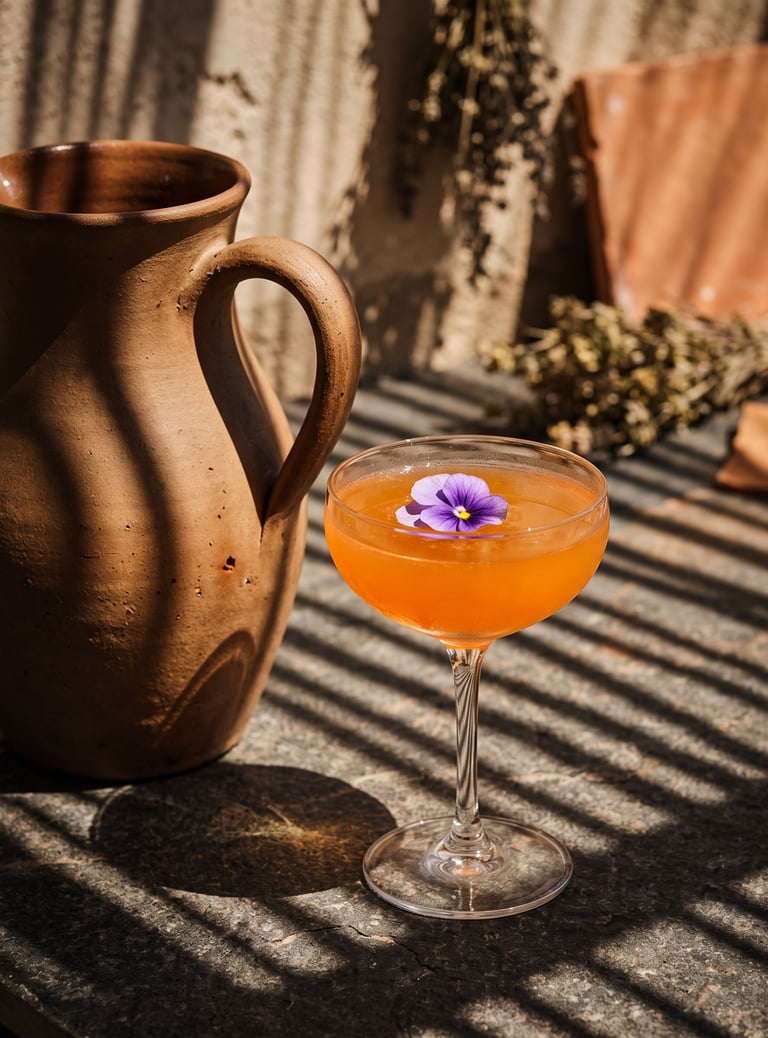
Branding and Visual Identity for AuraStay Hotel
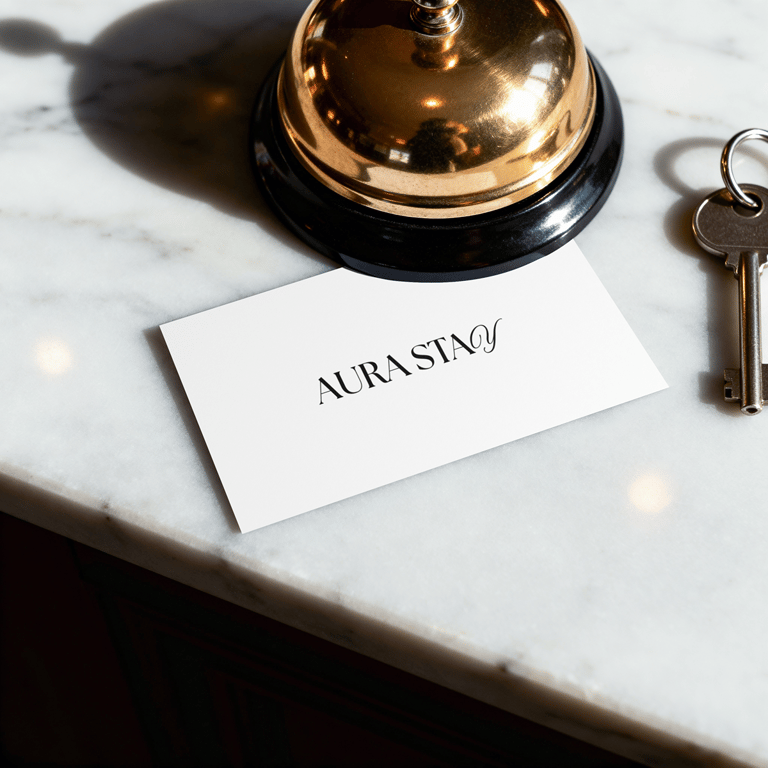
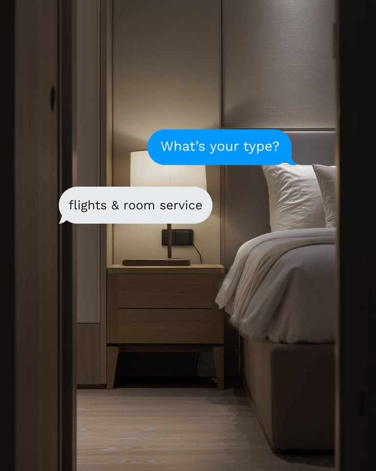
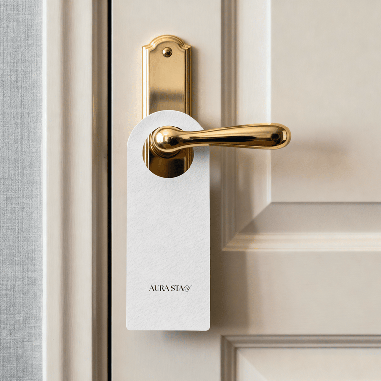
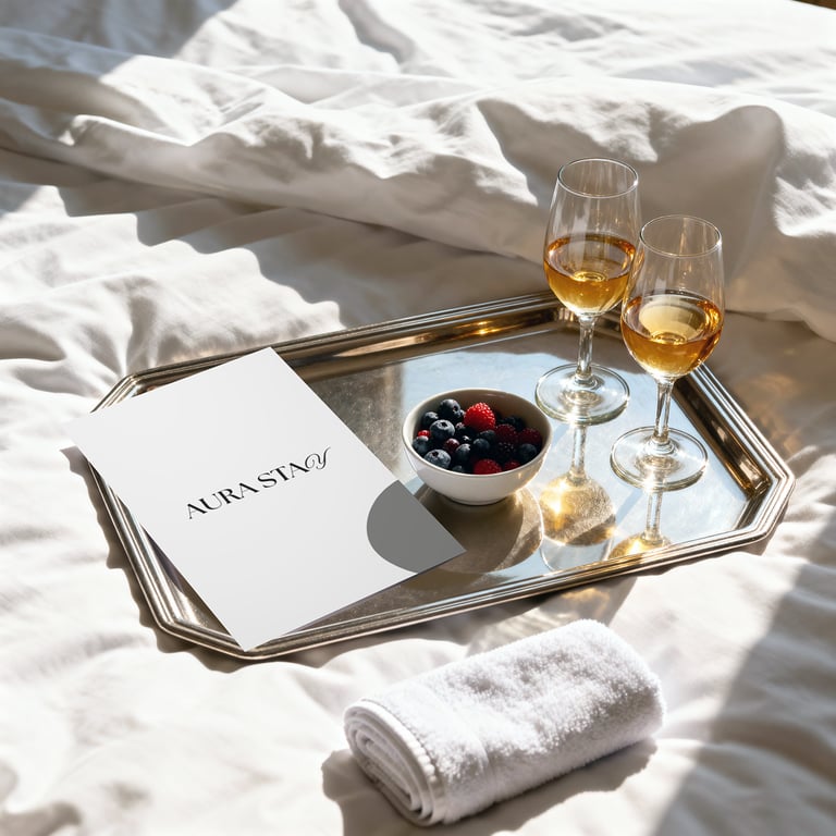
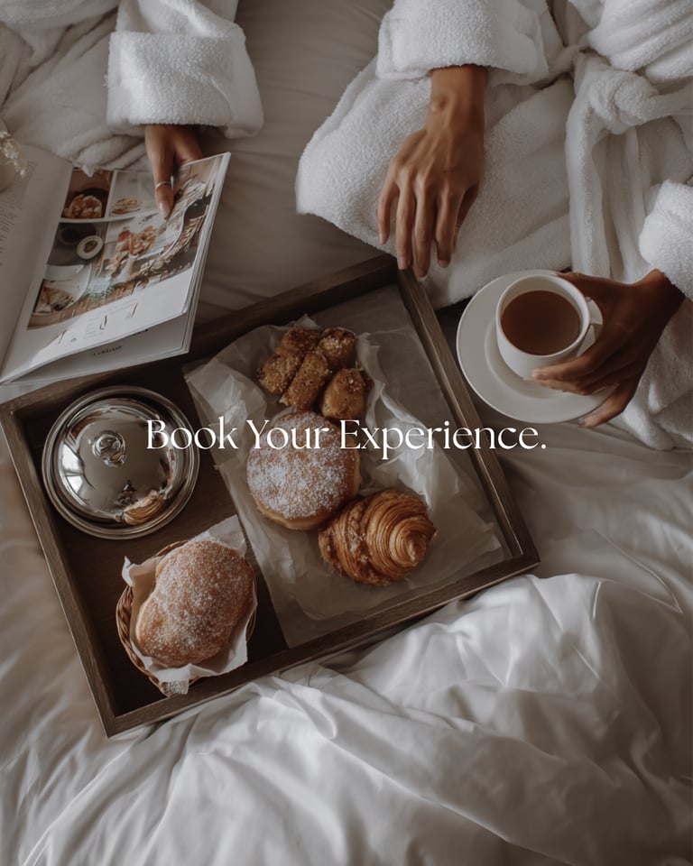
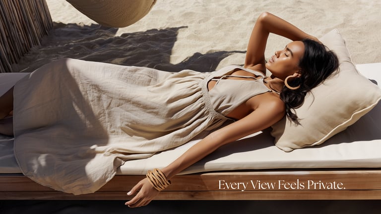
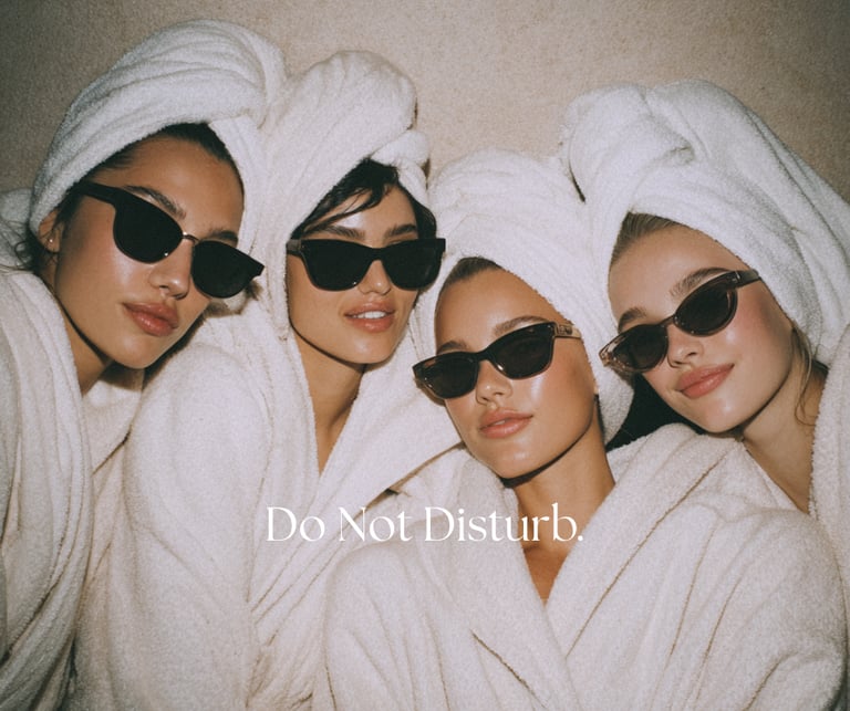
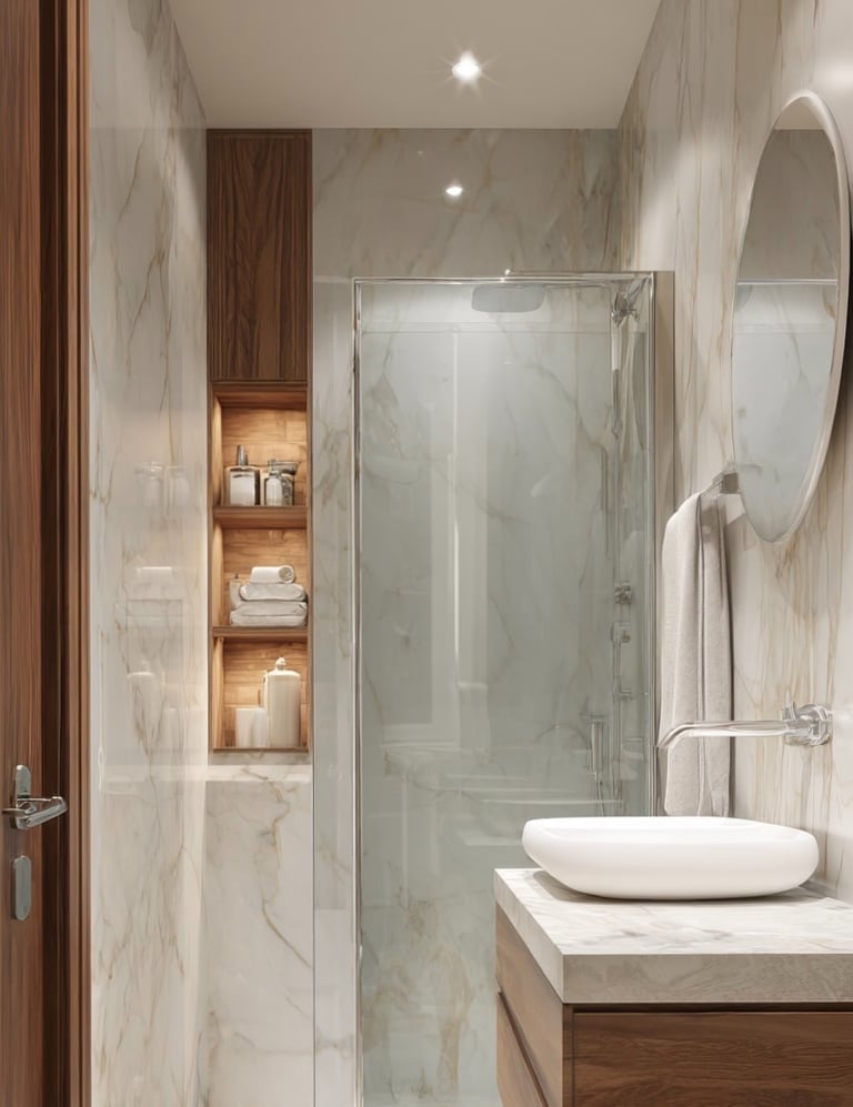

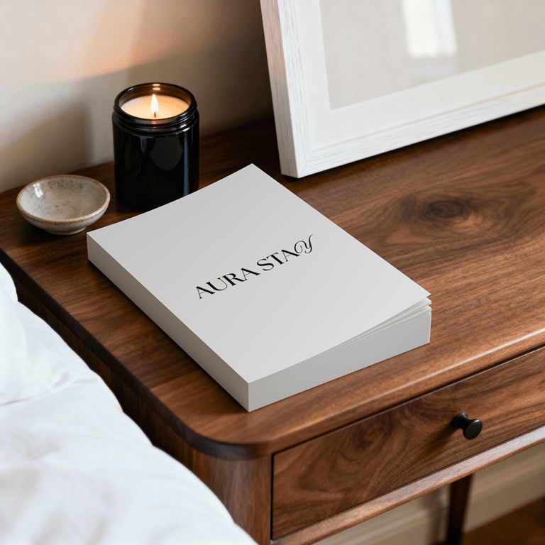
This is the branding and visual identity I designed for AuraStay Hotel, a luxury hospitality concept centered around calm, escape, and understated elegance.
The identity is built around a minimal and refined logo that reflects the hotel’s quiet sophistication and timeless character, while still carrying a subtle Gen Z sensibility through its clean, modern restraint and contemporary visual language. A soft, muted color palette combined with natural lighting and airy compositions sets the tone for a peaceful yet elevated experience.
The visual system was developed to communicate a sense of slow living and effortless luxury. Imagery focuses on intimate, tranquil moments such as room service, slow mornings, and quiet time spent on a balcony away from everyday noise. Overall, AuraStay positions itself as a serene escape that feels refined and luxurious, while still feeling fresh, relevant, and aligned with a younger, design conscious audience.
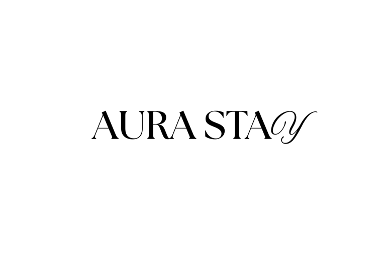
The Logo
The logo is a refined, minimal wordmark designed to reflect AuraStay’s understated sense of luxury. The clean, elegant letterforms create a timeless and balanced look, allowing the brand to feel sophisticated without being overly decorative.
A defining feature is the curved “Y” at the end, which adds a subtle but distinctive touch. This soft curve introduces a sense of fluidity and warmth, contrasting the structured typography and giving the logo a unique, recognizable finish. The result is a mark that feels both classic and modern, aligning with the hotel’s calm, elevated, and contemporary identity.
Branding and Visual Identity for The Late Bite Bakery

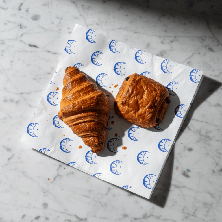
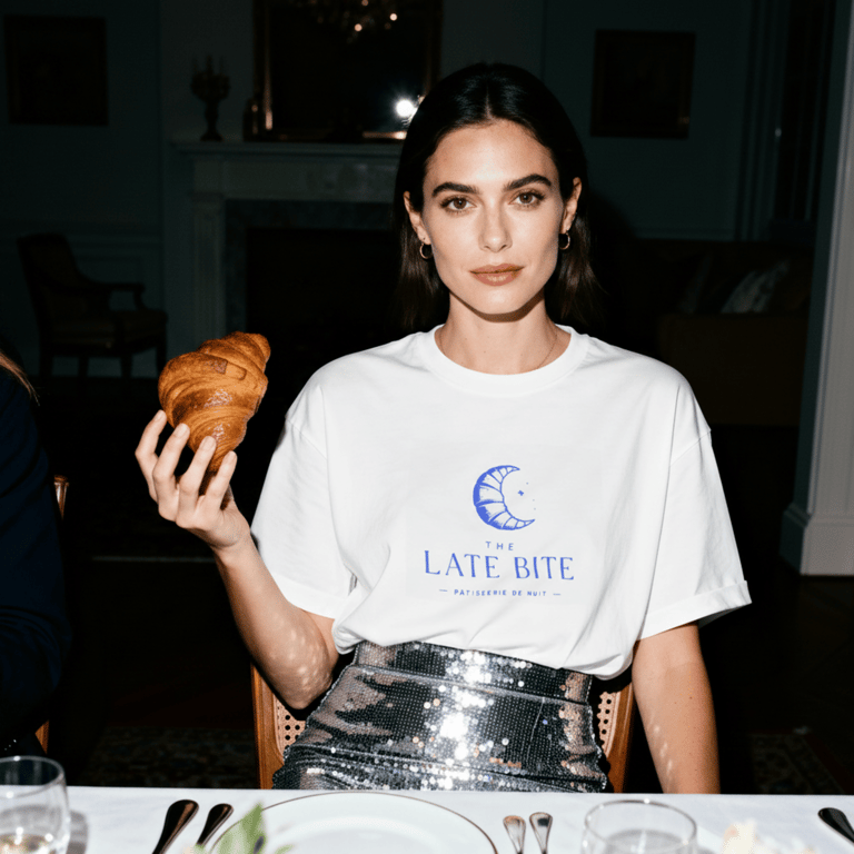
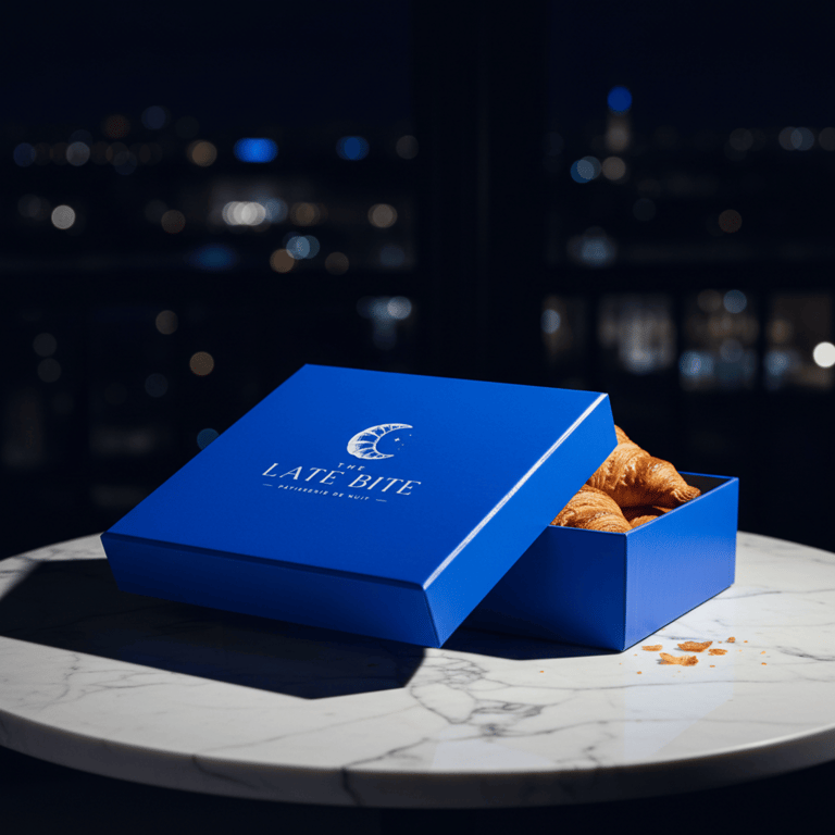
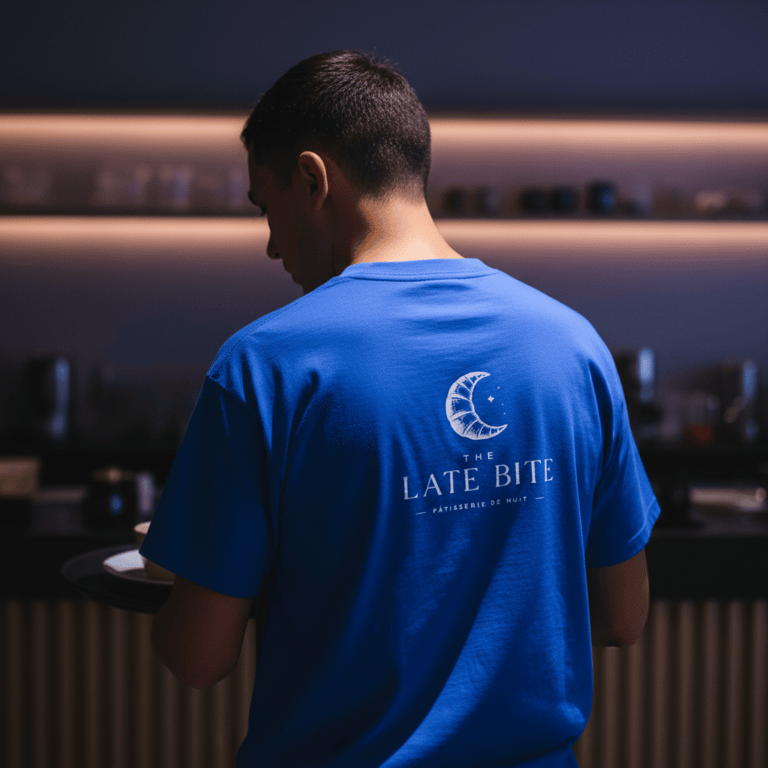
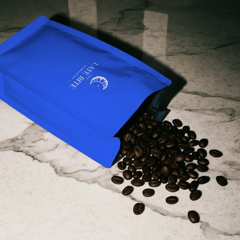
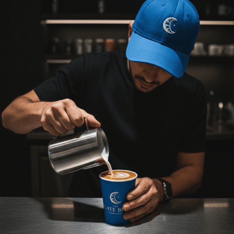
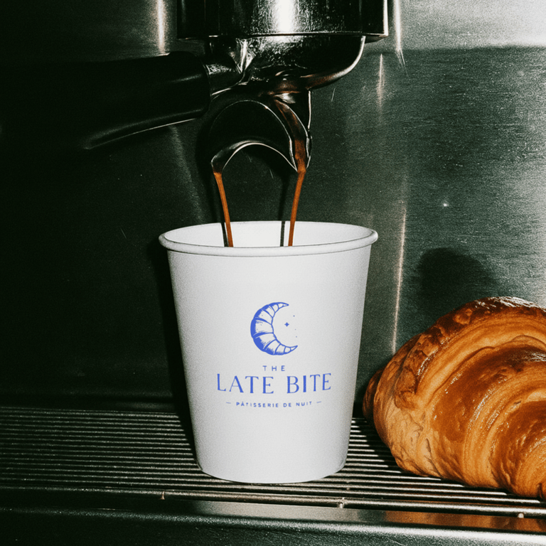
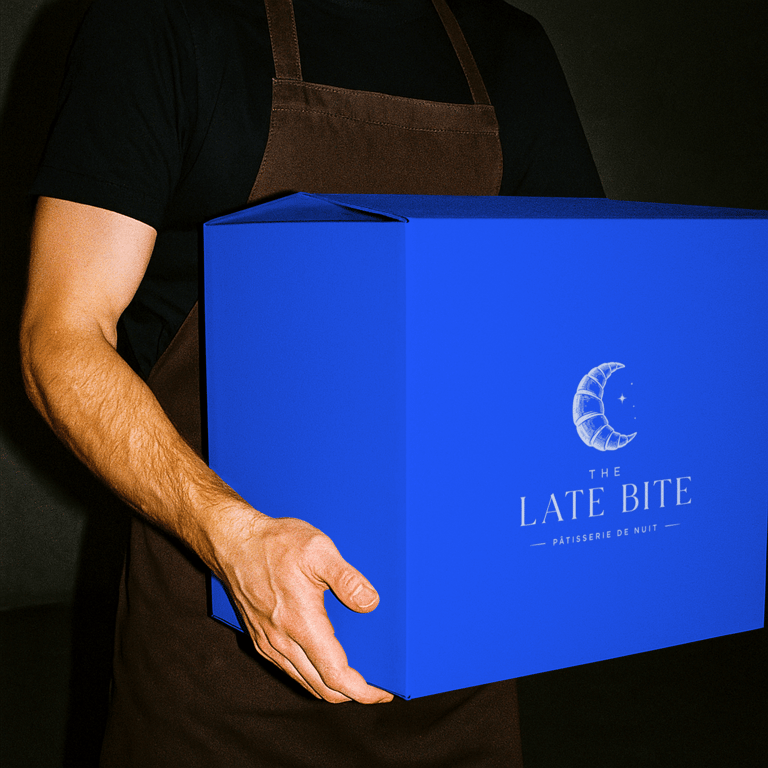
This is the branding and visual identity I designed for Late Bite, an after-hours bakery concept inspired by midnight cravings, city nightlife, and the quiet charm of fresh pastries long after sunset.
The identity is built around a distinctive croissant moon symbol, combining the warmth and familiarity of a neighborhood bakery with the energy and allure of late-night culture. Deep midnight blues, crisp typography, and a refined visual language create a brand that feels both playful and elevated. The aesthetic draws heavily from editorial photography and flash-lit nightlife imagery, giving the bakery a contemporary edge while maintaining an inviting sense of comfort.
The visual system was developed to capture the atmosphere of spontaneous late-night moments. Imagery focuses on freshly baked pastries enjoyed after dark, neon-lit streets, post-party gatherings, and intimate midnight stops for something sweet. Through its combination of sophisticated design and youthful energy, Late Bite positions itself as more than a bakery. It becomes part of the city's nightlife, offering a memorable experience that feels nostalgic, indulgent, and effortlessly cool.
The Logo
The Late Bite logo is built around a minimal croissant moon symbol, designed to capture the brand's unique blend of bakery comfort and late-night culture. Its clean, simplified form creates a memorable and versatile mark that feels modern, approachable, and instantly recognizable.
The defining feature of the logo is the crescent-shaped croissant, which cleverly references both freshly baked pastries and the moonlit hours in which the brand comes to life. This dual meaning gives the mark a distinctive personality while reinforcing the concept behind the brand. The result is a logo that feels playful yet refined, perfectly reflecting Late Bite's contemporary, after-dark identity.
Branding and Visual Identity for KYRA
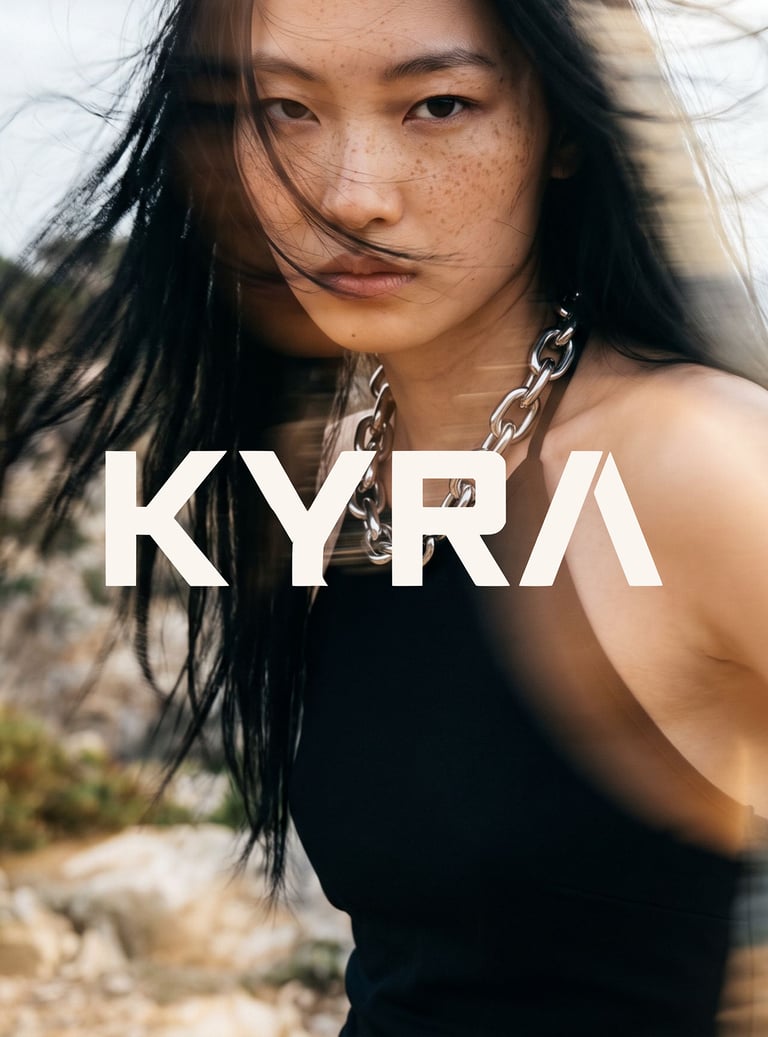
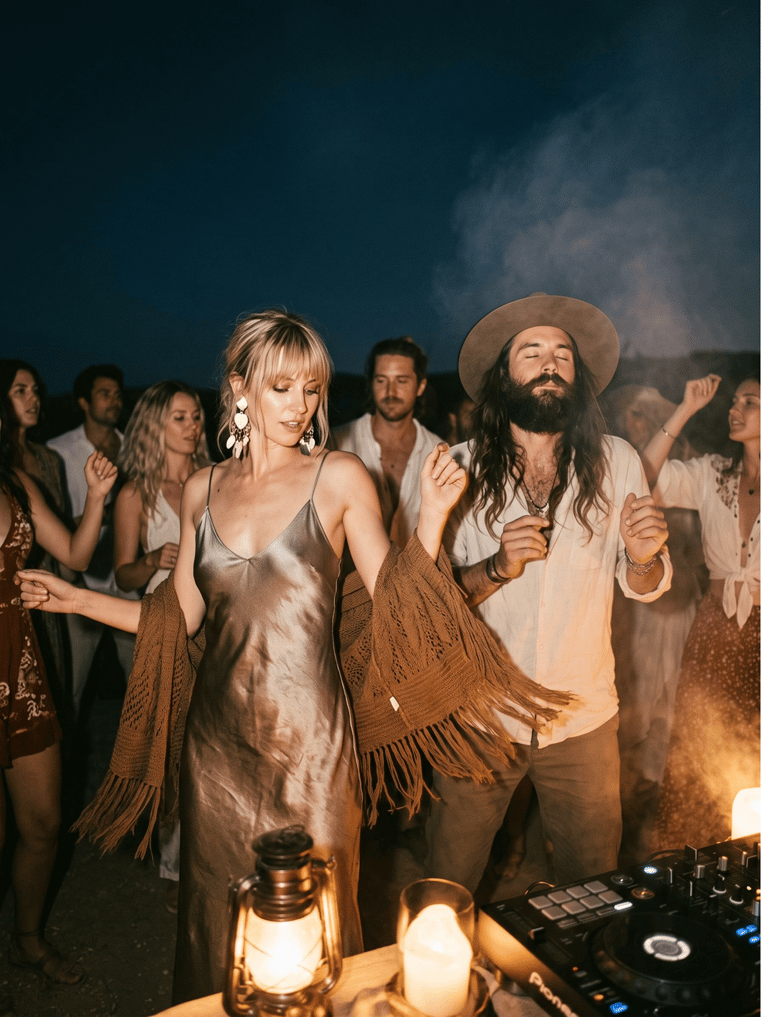
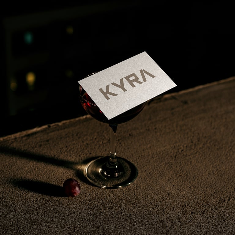
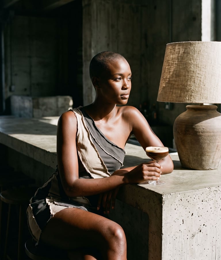

TThis is the branding and visual identity I designed for KYRA, a Mediterranean inspired nightclub concept shaped around warm coastal nights, ancient textures, and modern luxury nightlife culture.
The identity is built around earthy tones, sun faded neutrals, and deep terracotta accents, reflecting the raw beauty of Mediterranean architecture, stone, and sea worn surfaces. At the center of the system is a simple, sculptural wordmark that feels carved rather than printed, giving the brand a sense of permanence and quiet power. The visual language balances softness and strength, combining organic textures with sharp, editorial composition to create a refined but grounded luxury feel.
The system was developed to capture the atmosphere of slow burning nights that build into something electric. Imagery focuses on candle lit tables, coastal cliffside gatherings, marble interiors, golden hour fading into deep night, and expressive nightlife moments that feel intimate rather than chaotic. Flash photography is used intentionally to contrast warmth with intensity, echoing the rhythm of Mediterranean nights where time feels fluid.
KYRA positions itself as more than a nightclub. It becomes a cultural space where Mediterranean heritage meets contemporary nightlife, offering an experience that feels sensual, elevated, and deeply atmospheric, with a quiet luxury energy that lingers long after the night ends.
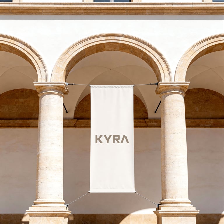
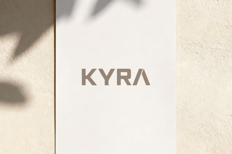
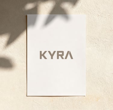
The Logo
The KYRA logo is built around a minimal, sculptural wordmark designed to reflect the brand’s blend of Mediterranean heritage and elevated nightlife luxury. The form is clean and intentional, with subtle character in the letter shaping that feels grounded, timeless, and quietly powerful.
The defining feature of the identity is its restrained typographic construction, which draws inspiration from carved stone signage and classical Mediterranean architecture. This gives the logo a sense of permanence and tactility, while still feeling modern and editorial in execution. The simplicity of the design allows it to sit confidently across both atmospheric nightlife environments and more refined brand touchpoints.
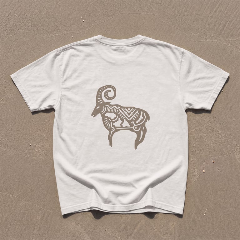
Branding and Visual Identity for No Sleep Club
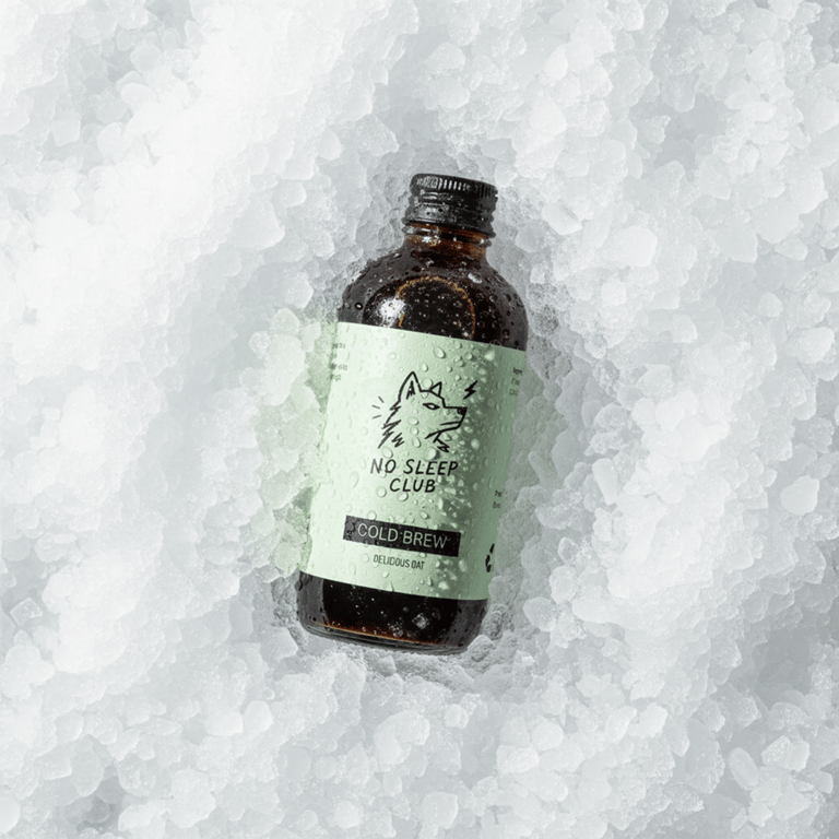
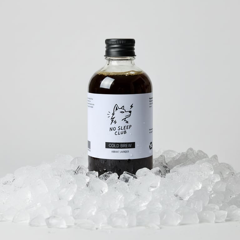
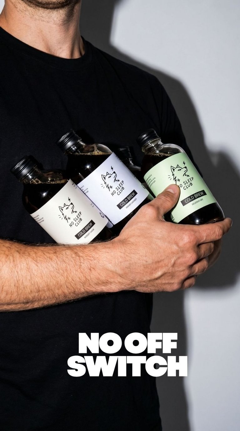
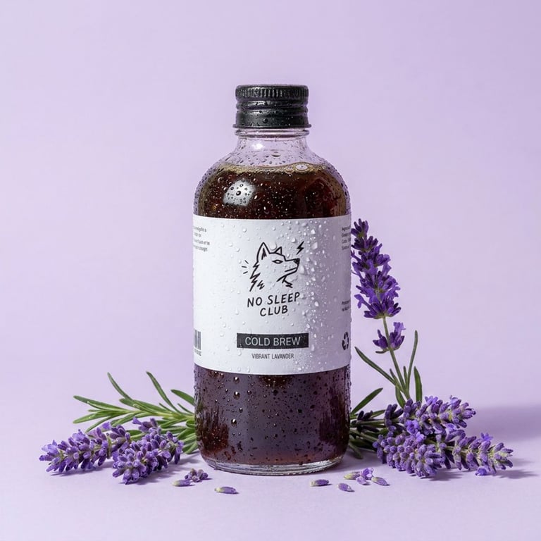
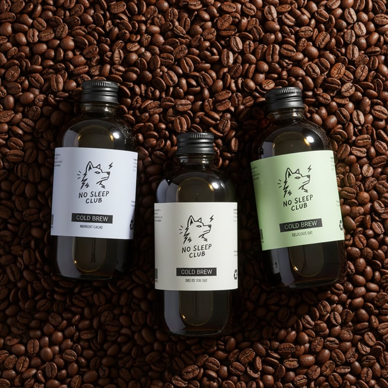
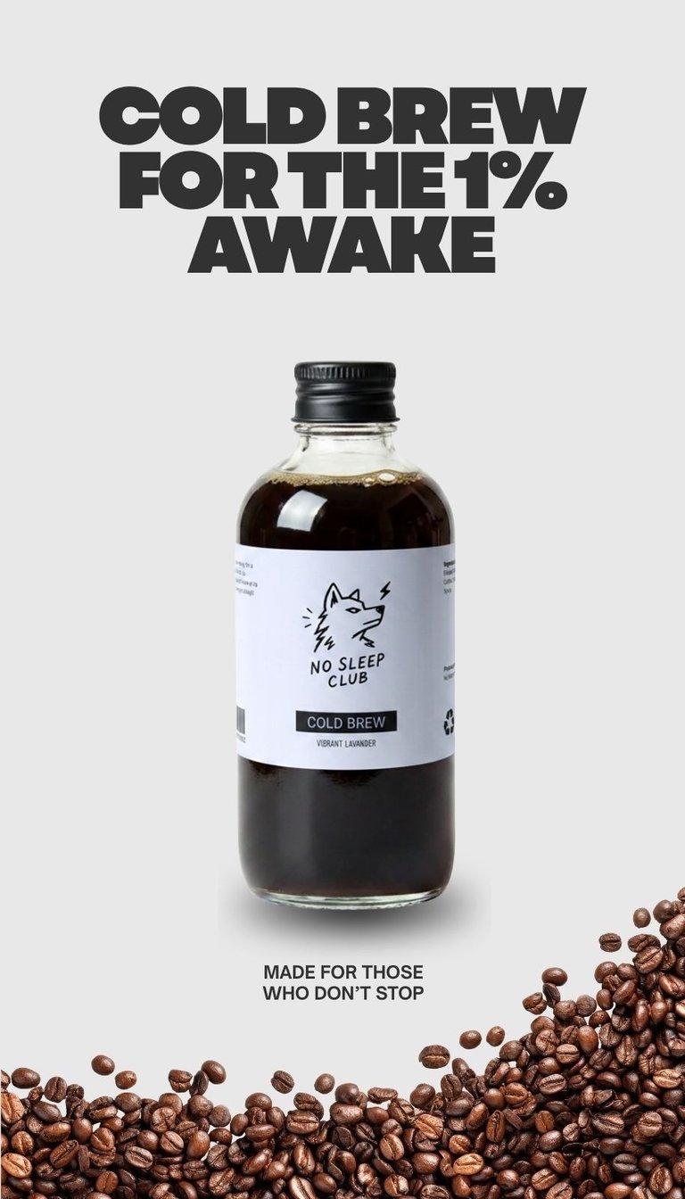
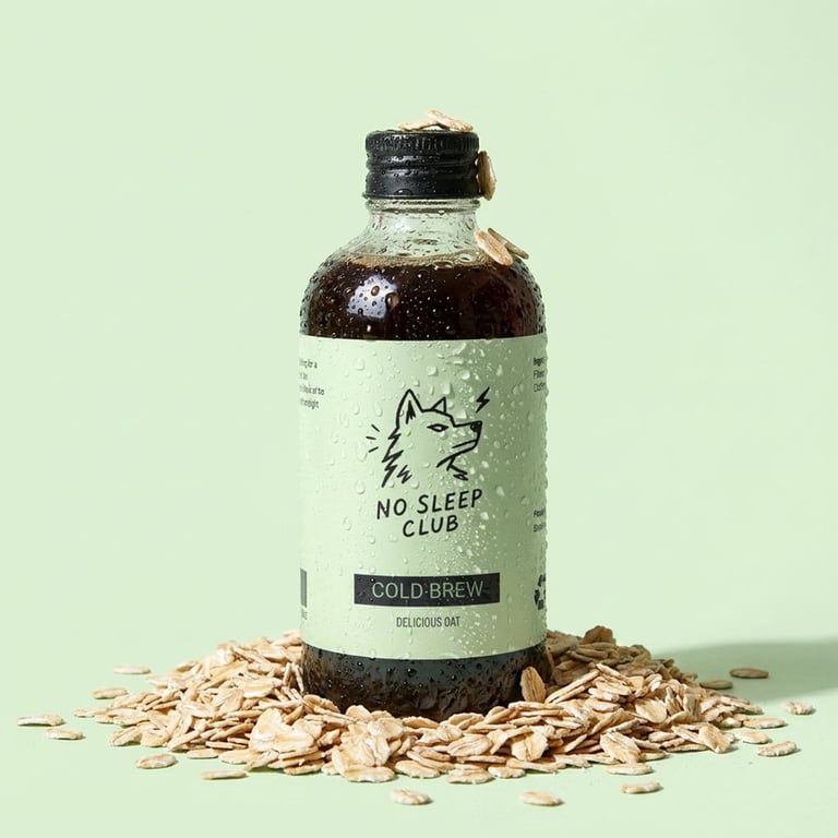
One of my recent favorites: branding and visual identity for No Sleep Club, a cold brew coffee concept created for ambitious individuals who thrive on momentum, discipline, and late nights spent chasing goals.
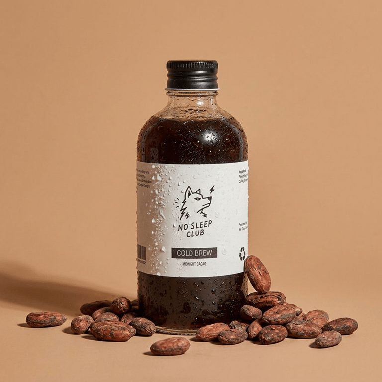
The identity combines bold typography, minimalist packaging, and a distinctive wolf mascot to create a brand that feels modern, energetic, and unapologetically driven. A clean monochromatic foundation is complemented by subtle accent colors that differentiate product variations while maintaining a cohesive and premium appearance.
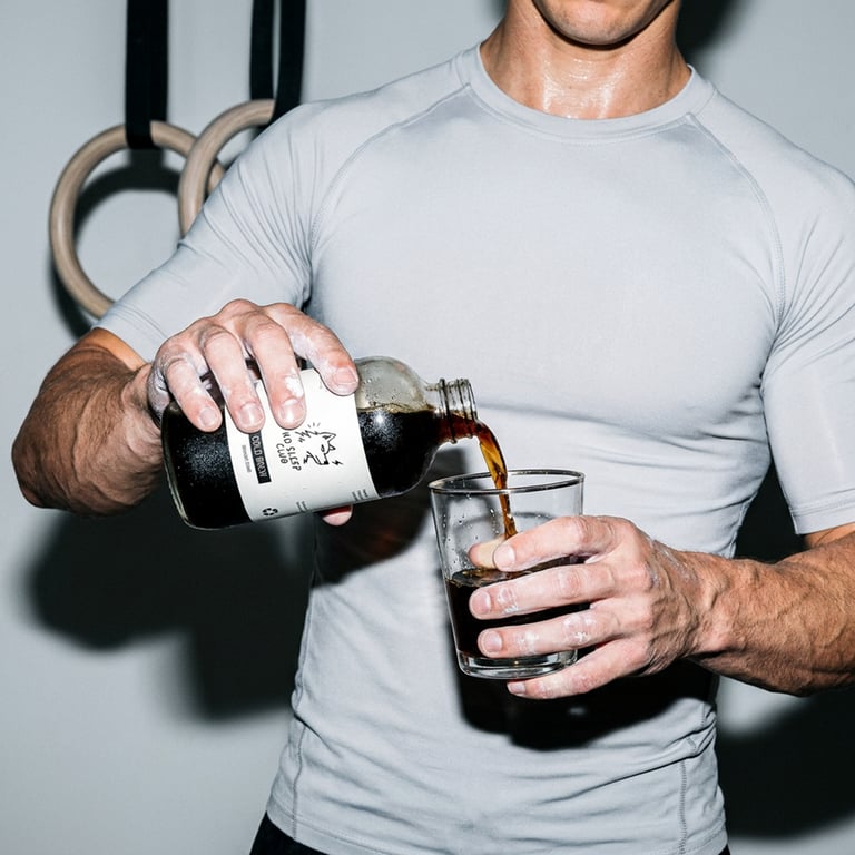
The visual system was developed to communicate focus, productivity, and endurance. Product photography emphasizes freshness, simplicity, and natural ingredients, while spacious layouts and strong typography reinforce the brand's confident attitude. No Sleep Club positions itself as more than a coffee brand. It represents a mindset of persistence, ambition, and showing up every day, even when everyone else has gone to sleep.
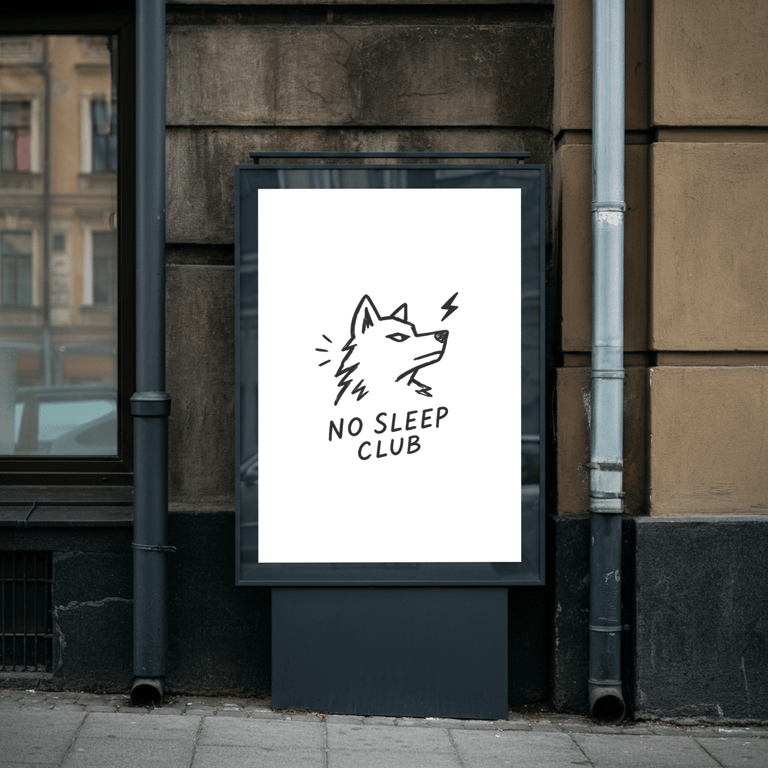
The Logo
The No Sleep Club logo is built around a bold wolf icon paired with clean, confident typography, creating a strong and instantly recognizable identity. The wolf symbolizes focus, resilience, and relentless ambition, perfectly aligning with the brand's "Grind Never Sleeps" philosophy.
Designed with minimal line work and a modern aesthetic, the mark balances character and simplicity, making it highly versatile across packaging, apparel, and digital applications. The result is a logo that feels energetic, memorable, and driven by purpose, reflecting the mindset of those who are always pushing forward.
Brand identity for Calle Tacos - Street food vendor
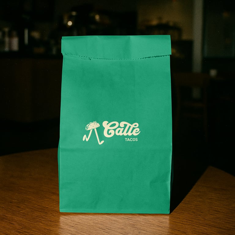
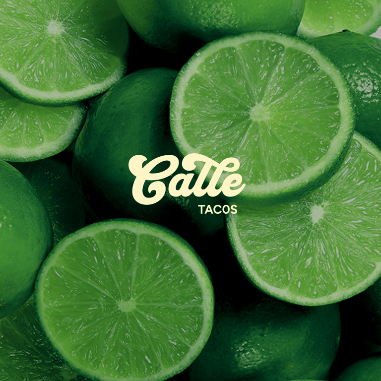
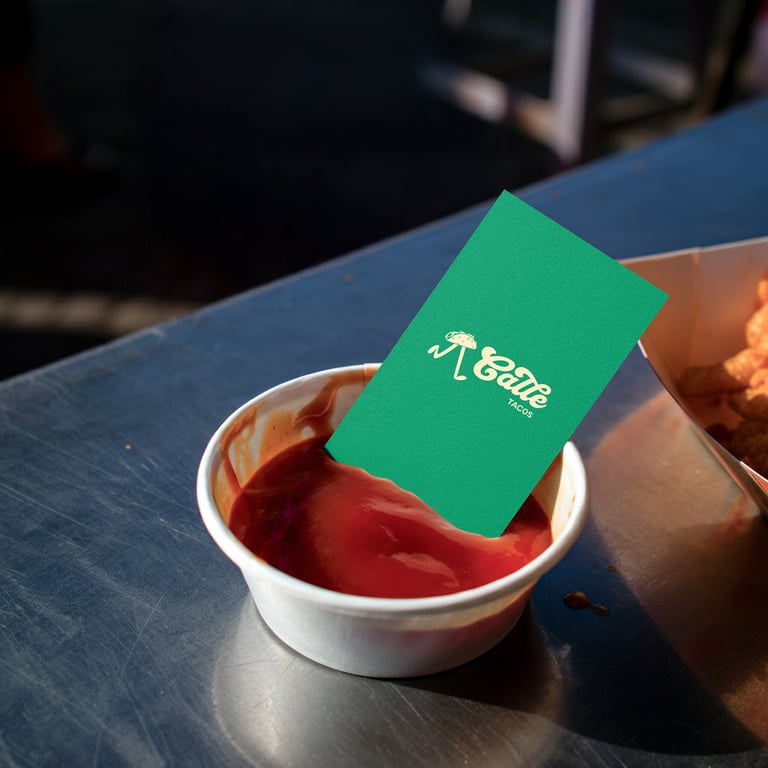
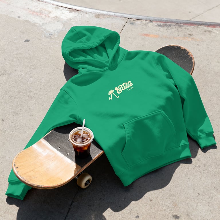
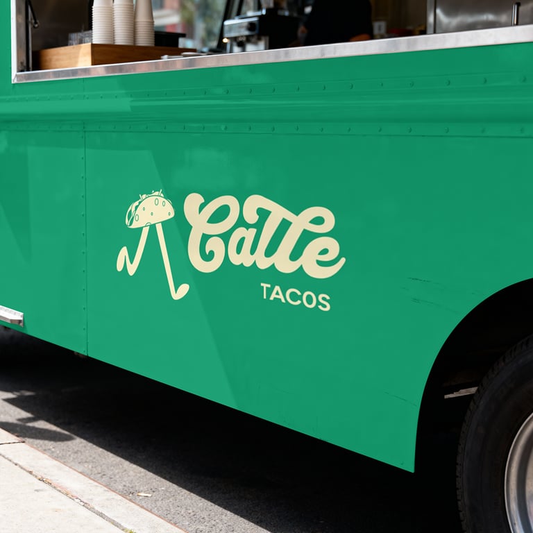
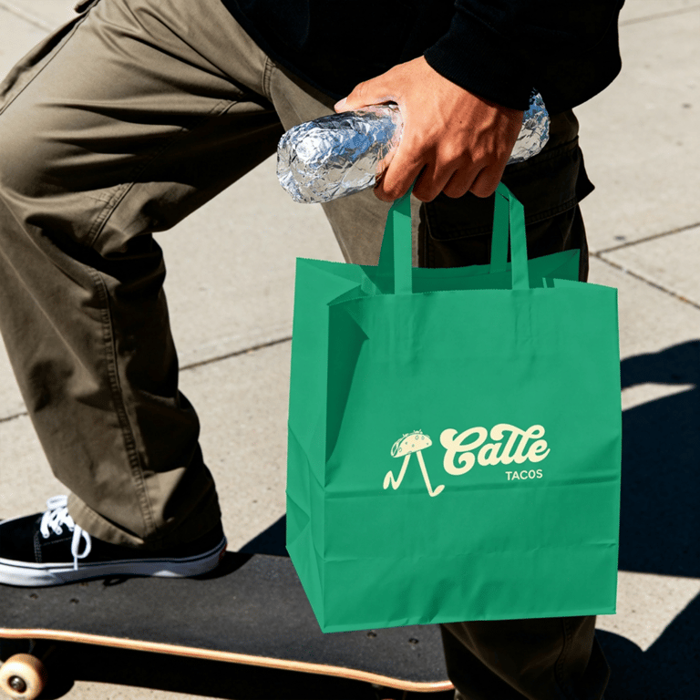
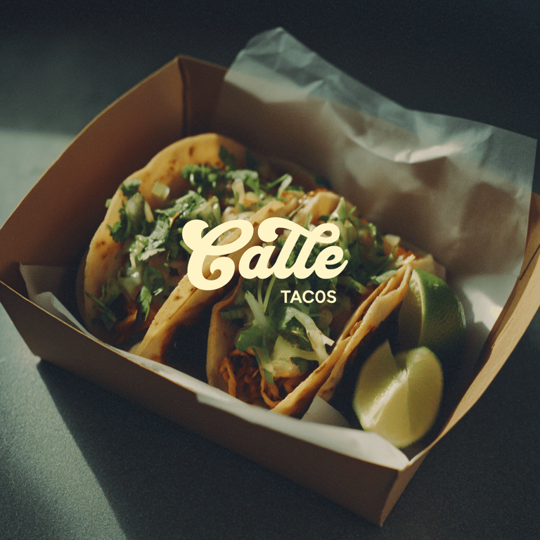
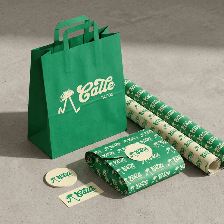
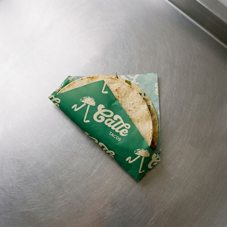
This is the branding and visual identity I designed for Calle Tacos, a vibrant street food concept inspired by the energy of Mexican street culture and the simple joy of great food shared with others.
The identity is built around a playful taco character paired with a bold custom wordmark, creating a brand that feels approachable, memorable, and full of personality. A fresh green and cream color palette brings a sense of authenticity and freshness, while the combination of expressive script typography and clean supporting type creates a balance between character and clarity.
The visual system was developed to capture the lively spirit of street food culture. From the handcrafted mascot to the energetic layouts and bold packaging, every element is designed to feel welcoming, fun, and instantly recognizable. Calle Tacos positions itself as more than a place to grab a meal. It becomes a brand experience centered around flavor, community, and memorable moments shared over great tacos.
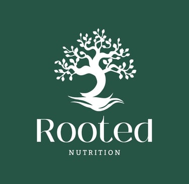
Branding and Visual Identity for Rooted Nutrition
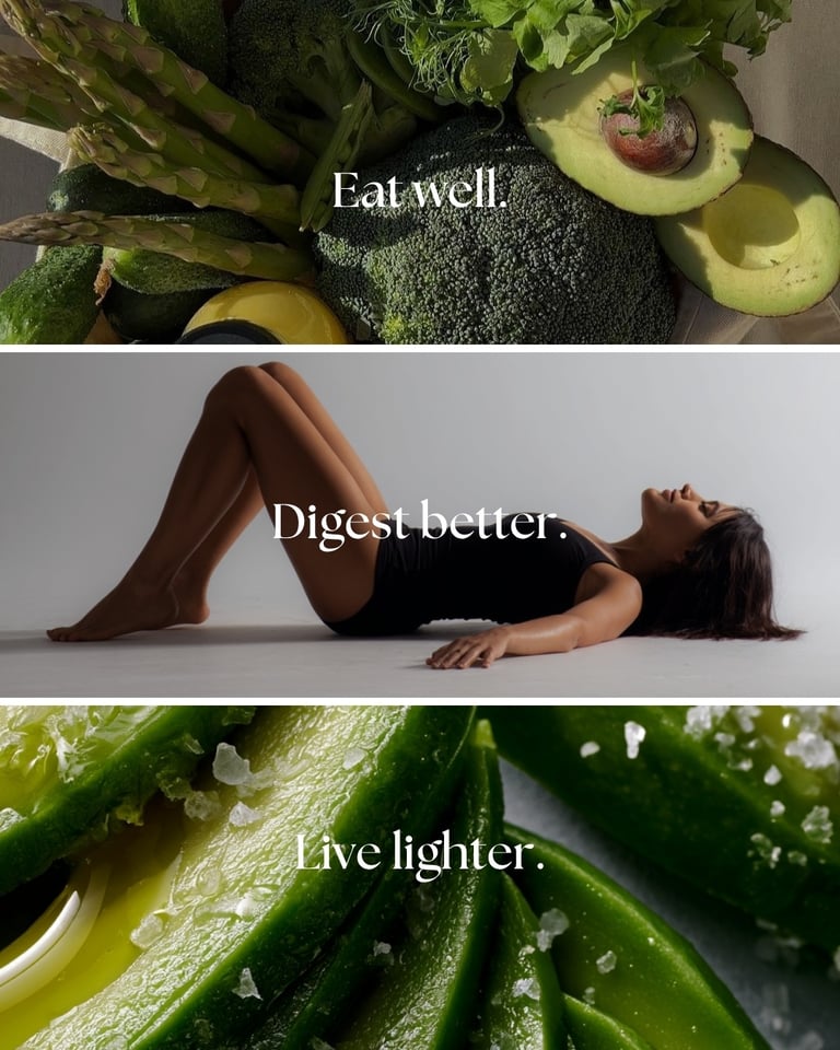
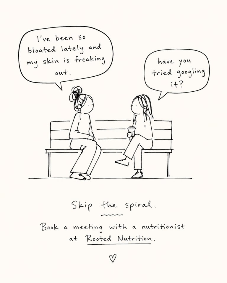
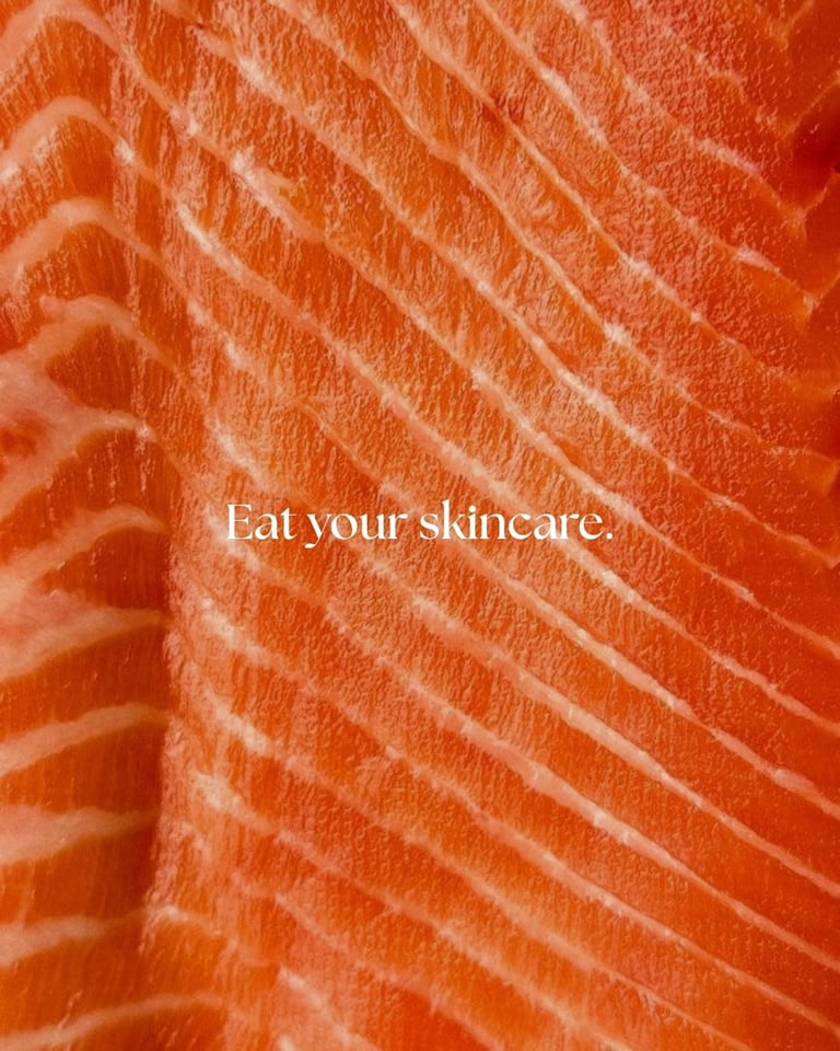
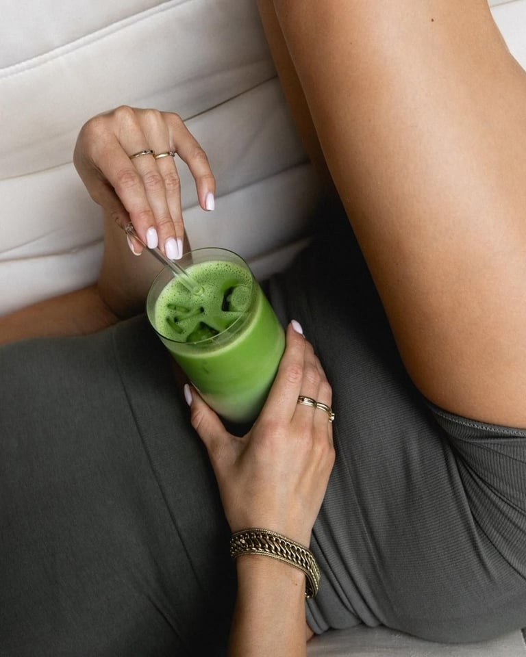
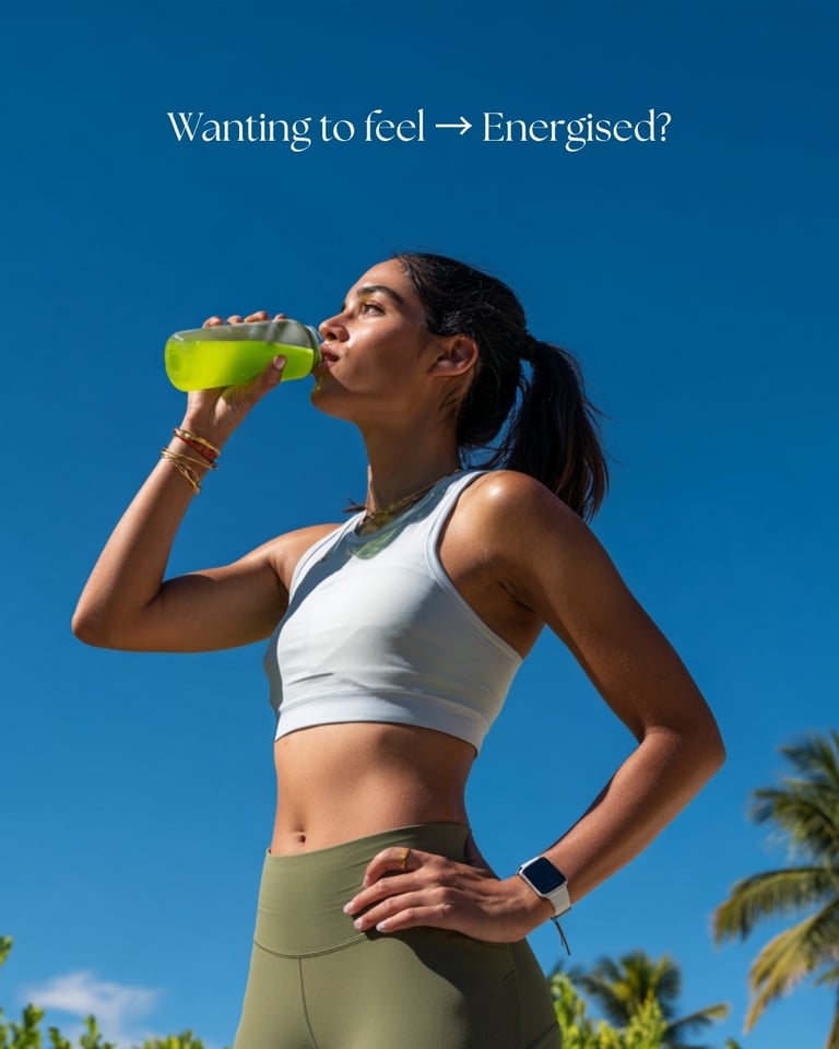
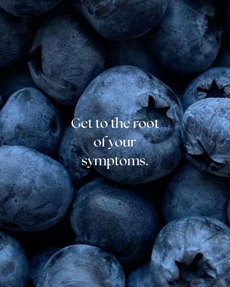
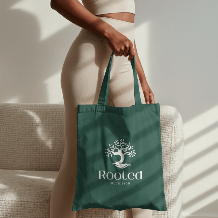
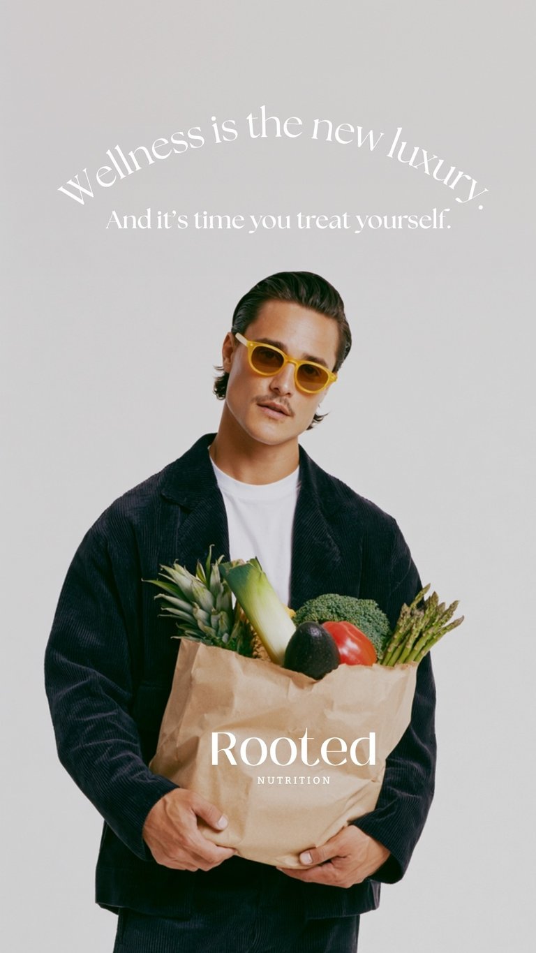
The branding and visual identity for Rooted Nutrition was designed around the idea that wellness begins at the root. Centered on nourishment, balance, and the connection between food and overall wellbeing, the brand blends modern wellness culture with a calm, elevated aesthetic that feels both approachable and refined.
The identity uses a minimal visual language paired with earthy tones, soft neutrals, and organic textures to reflect grounded living and natural healing. Inspired by fresh produce, slow routines, and mindful habits, the overall direction communicates a sense of ease rather than restriction, positioning healthy living as something beautiful, sustainable, and deeply personal.
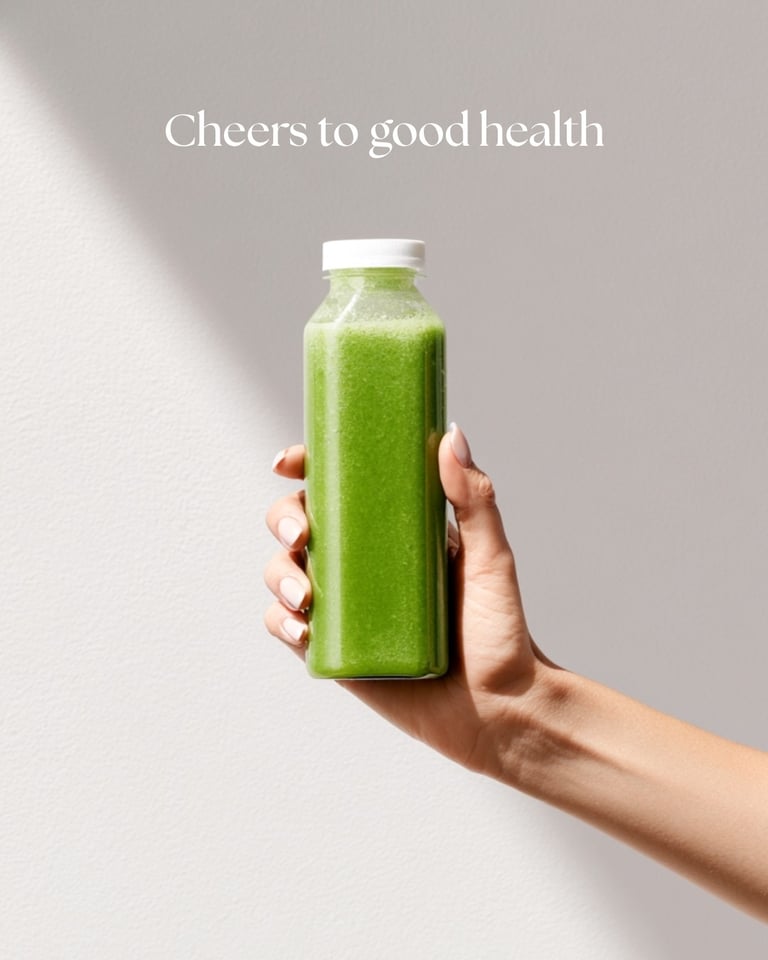
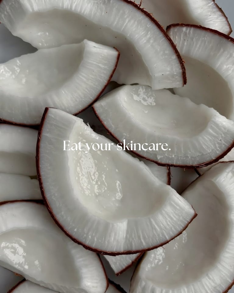
The visual system combines clean typography with understated editorial compositions, creating a modern yet warm atmosphere that appeals to a younger, design conscious audience. Imagery focuses on intimate everyday moments such as grocery shopping, preparing fresh meals, morning rituals, and caring for your body from within. Particular emphasis is placed on the relationship between nutrition, gut health, energy, and skin, reinforcing the idea that feeling good internally is reflected externally.
Overall, Rooted Nutrition positions itself as a contemporary wellness brand that makes healthy living feel aspirational, effortless, and aesthetically grounded, while still rooted in science, balance, and self care.
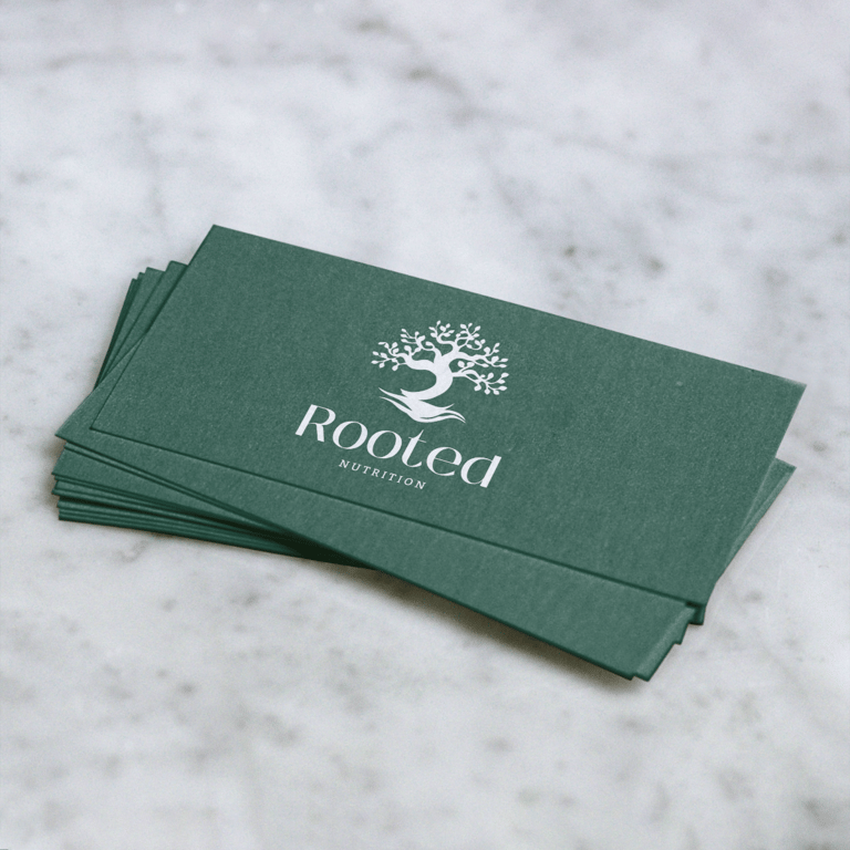
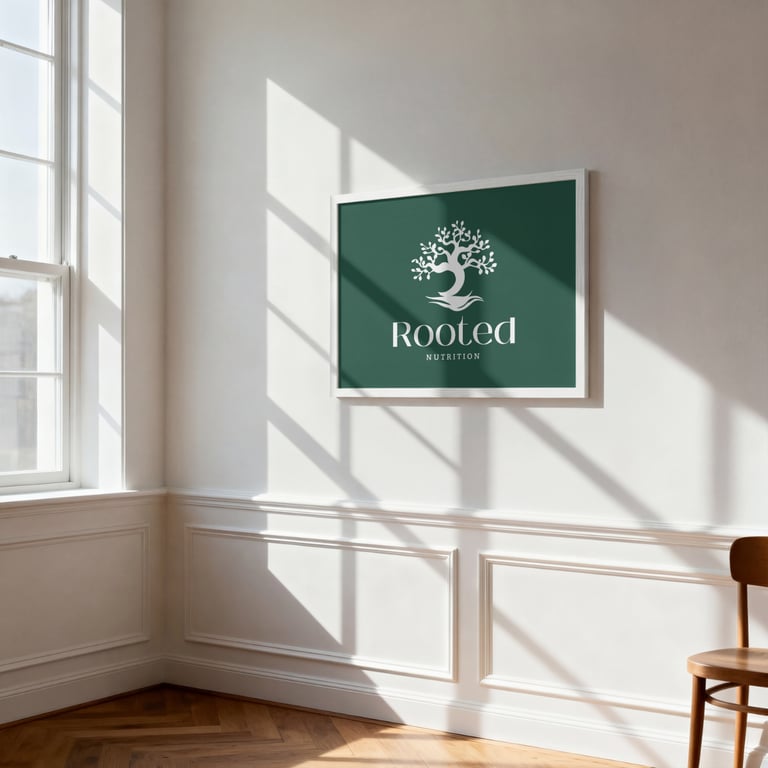
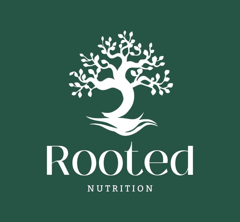
The Logo
The logo for Rooted Nutrition is a refined minimal wordmark that reflects a natural, science-based approach to health and wellbeing. The elegant typography gives it a clean, luxury feel while still staying approachable and grounded.
A simple tree symbol sits within the identity, representing growth, balance, and the idea that good nutrition supports the body from the roots up.
The color palette uses deep forest green and white, creating a calm, fresh, and trustworthy look. The green brings in nature and nourishment, while the white keeps the design modern, clean, and clinical.
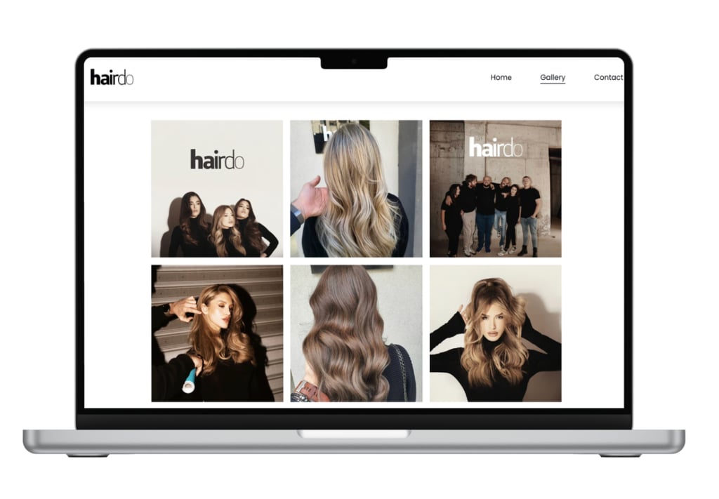
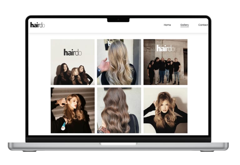
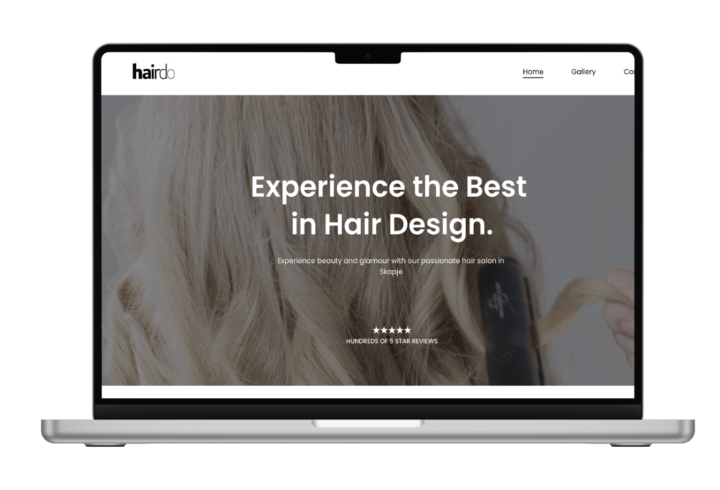
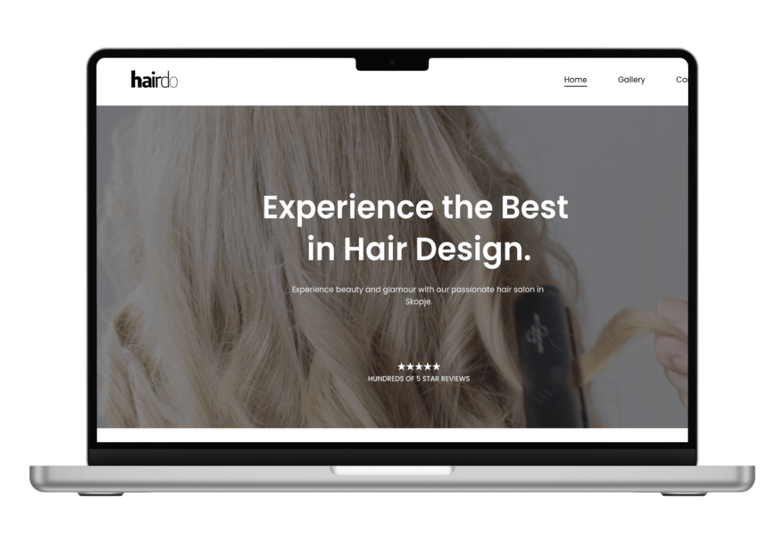
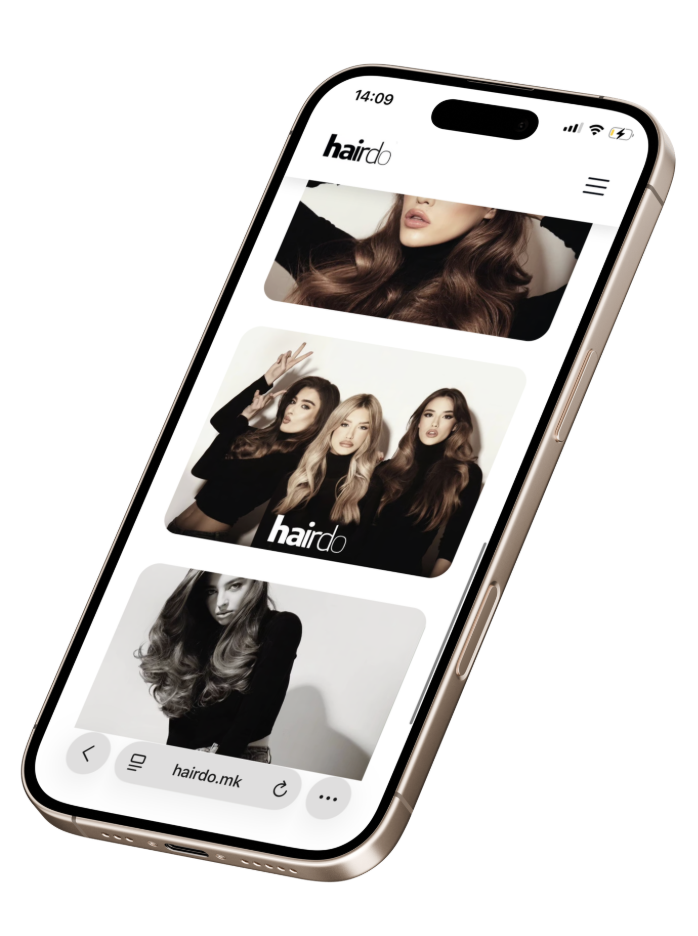
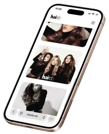
Website design for HairDo
The Hairdo website concept revolves around modern luxury, trust, and bold visual assurance, prioritizing the work itself over dense text or intricate designs.
It employs a minimalist, neutral palette of soft whites, blacks, and subtle warm hues to spotlight hair textures, colors, and styling nuances. This approach delivers a high-end vibe without clutter, aligning with expectations for premium beauty brands.
Meta Campaign for Trailblazer Hydration Pack
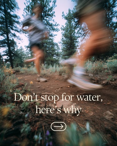
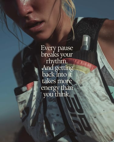
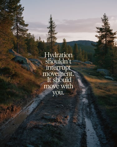
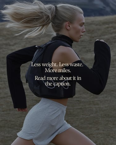

A performance-driven Meta carousel campaign built around the idea of uninterrupted movement. The concept starts with a strong, curiosity-led hook and guides the viewer through a simple narrative, showing how traditional gear disrupts performance and how Trailblazer removes that friction.
Visually, the campaign uses a minimalist approach, combining natural landscapes, fit athletes in motion, and subtle product integration to maintain a premium feel. A consistent color palette and clean typography tie the system together, creating a cohesive and scroll-stopping experience that feels both aspirational and grounded in real use.
Visual Identity for Zen Matcha
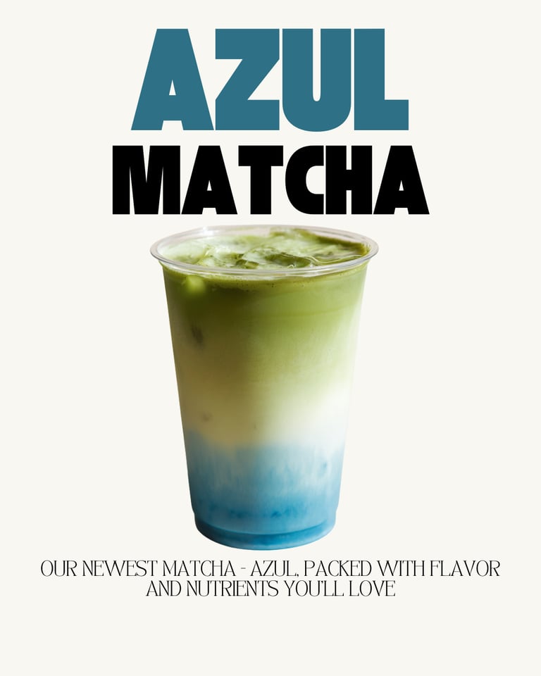
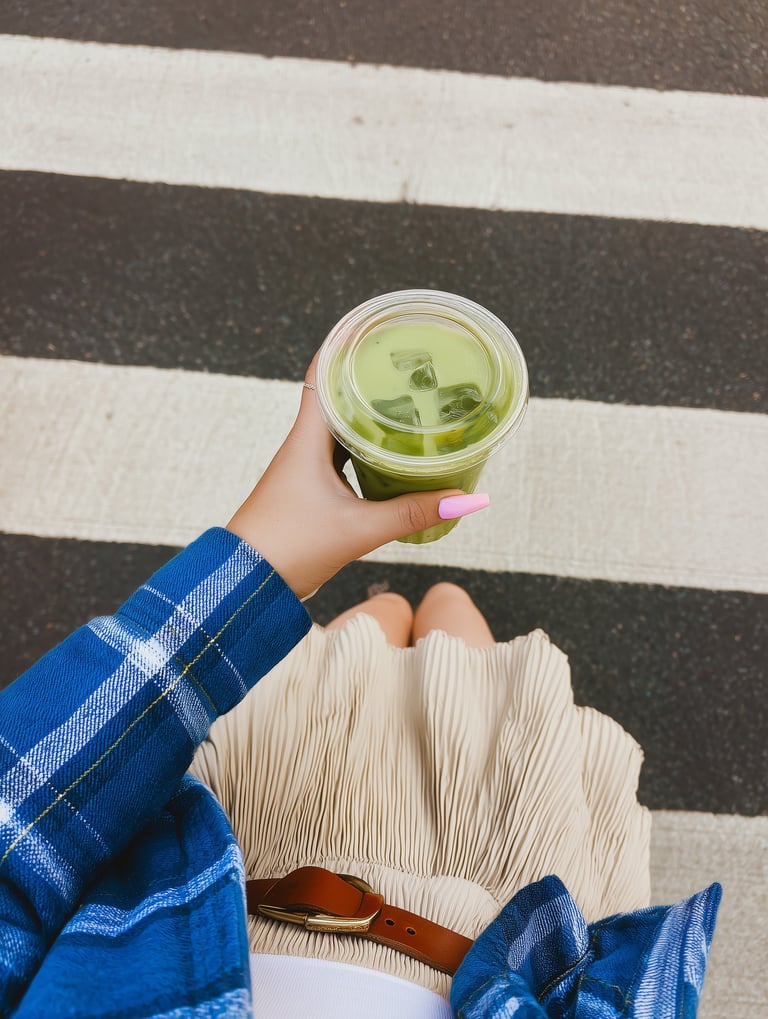
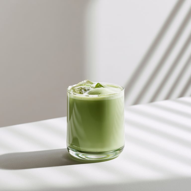
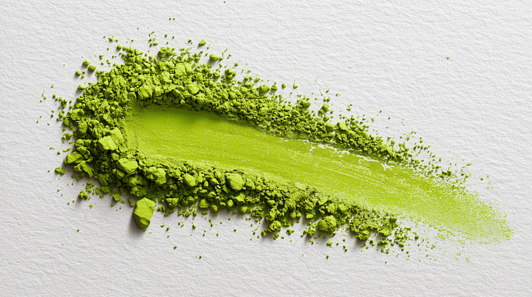
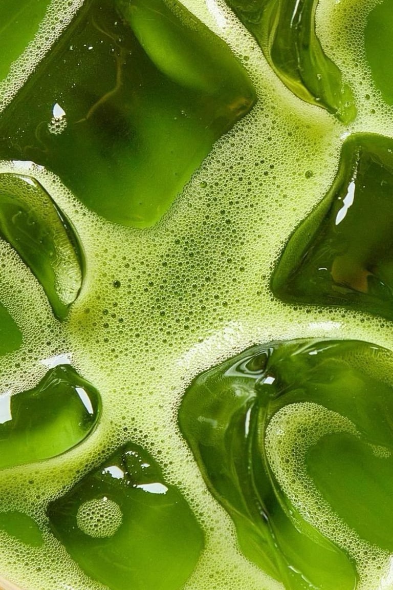
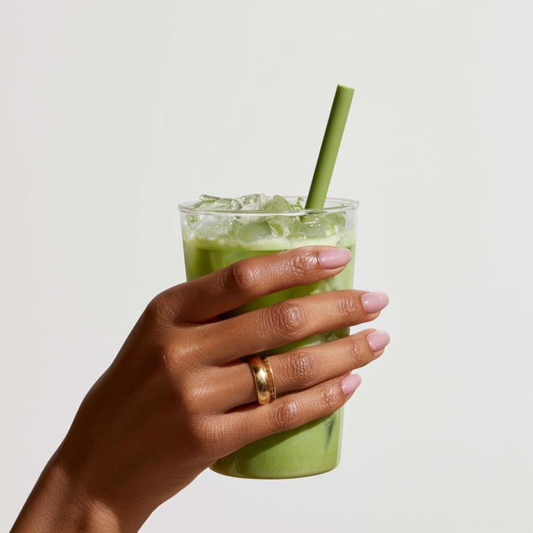
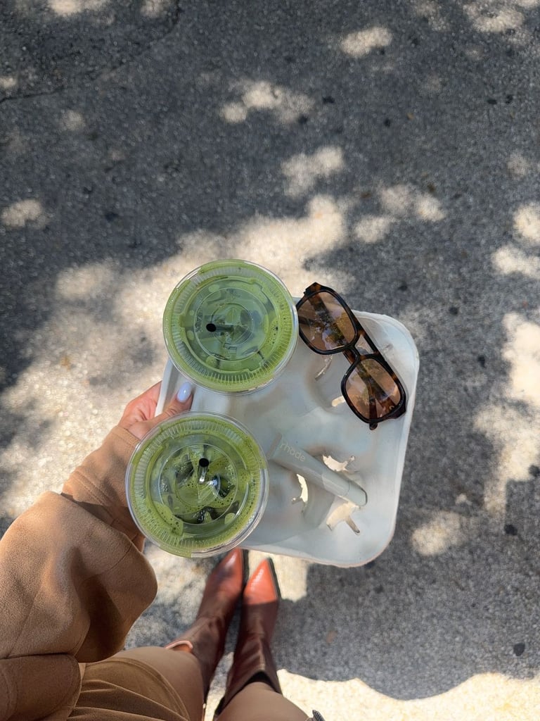

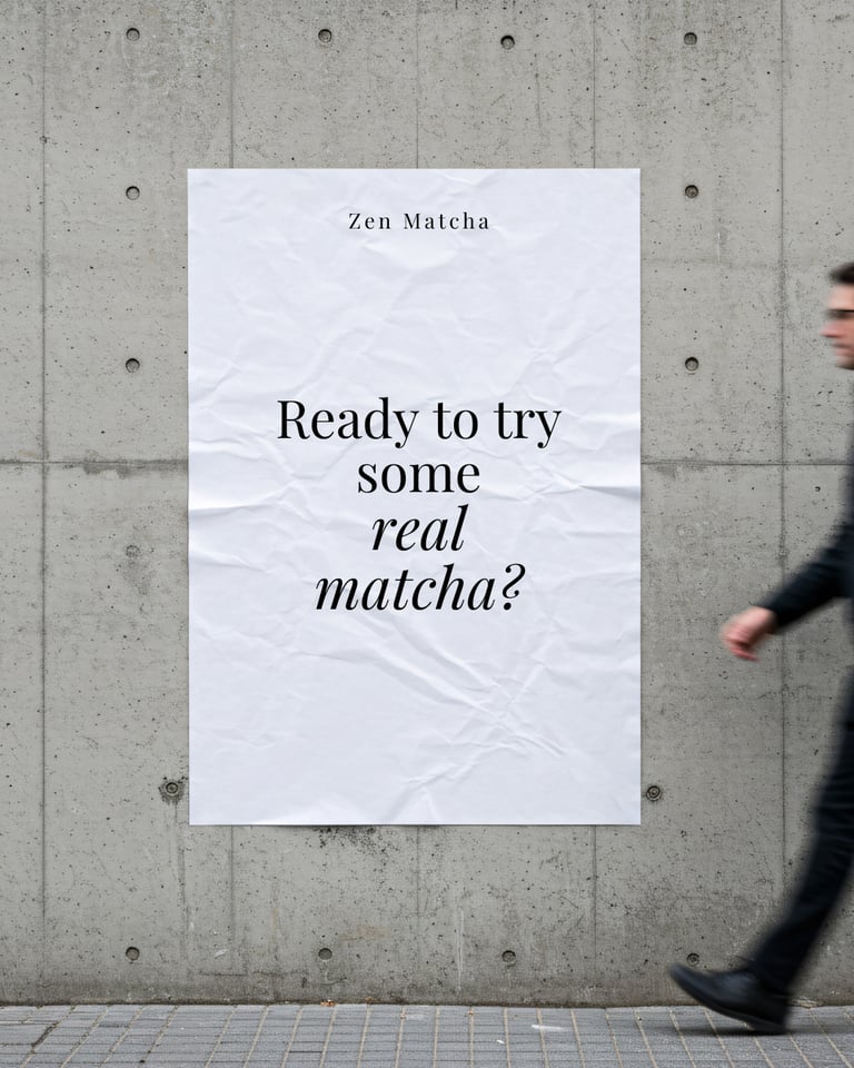
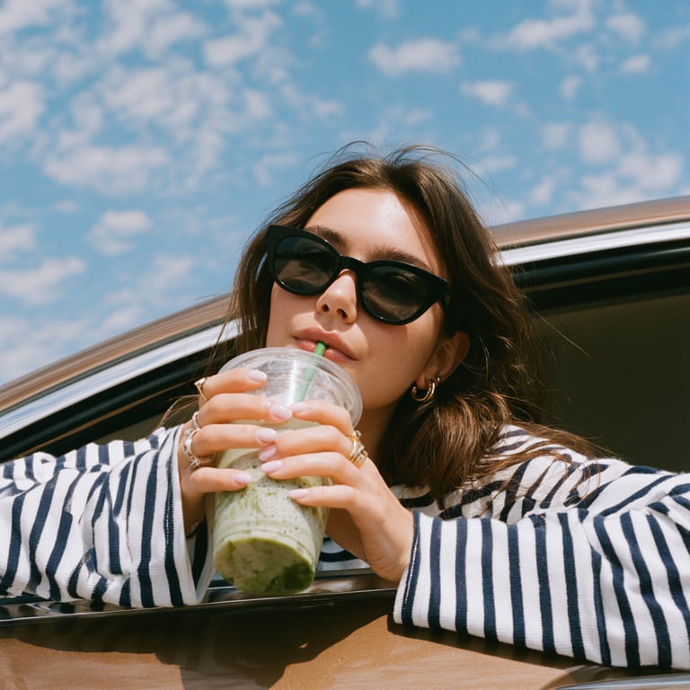
This social media identity for Zen Matcha focused on building a cohesive, instantly recognizable Instagram presence.
The goal was to turn the feed into a consistent brand experience using color, layout, and typography.
When a visual system is done right, every post reinforces the brand.
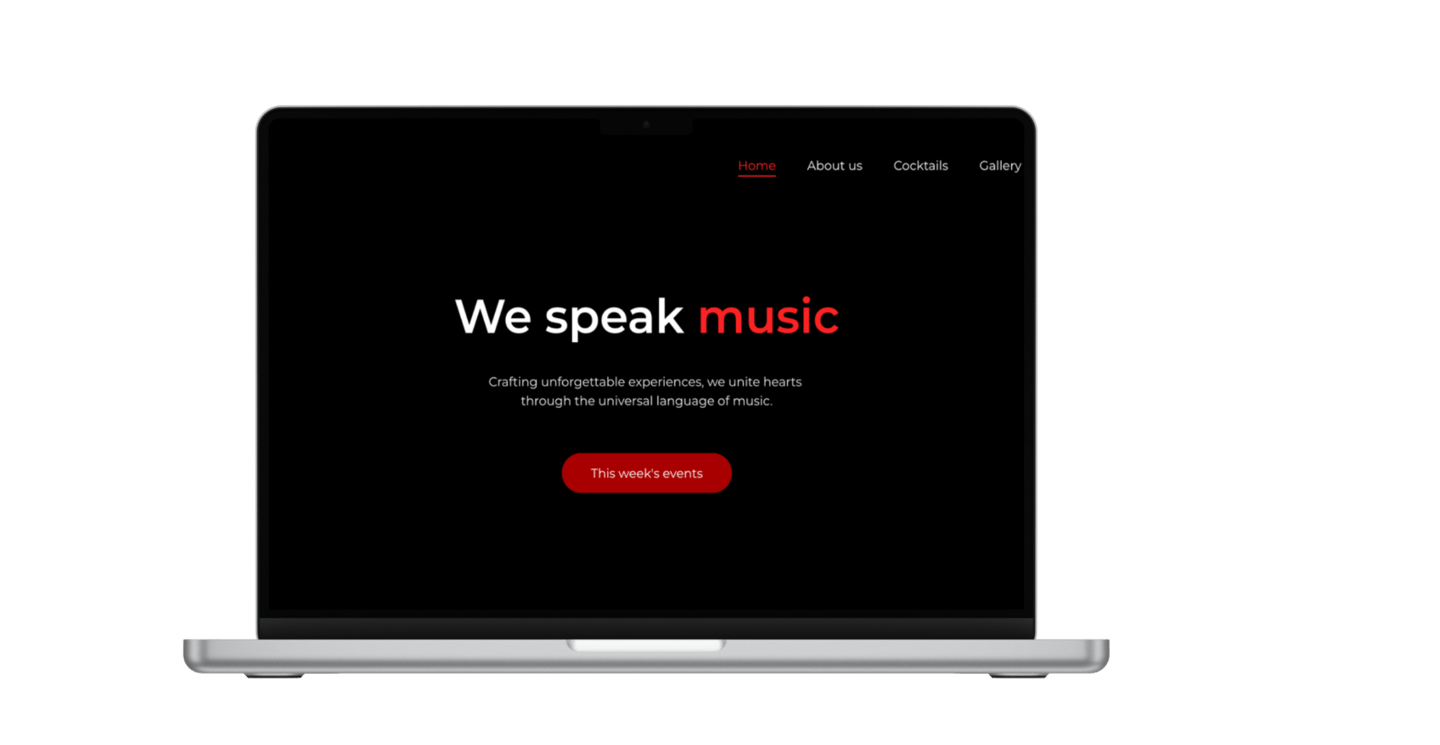
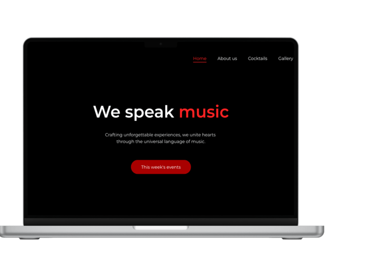
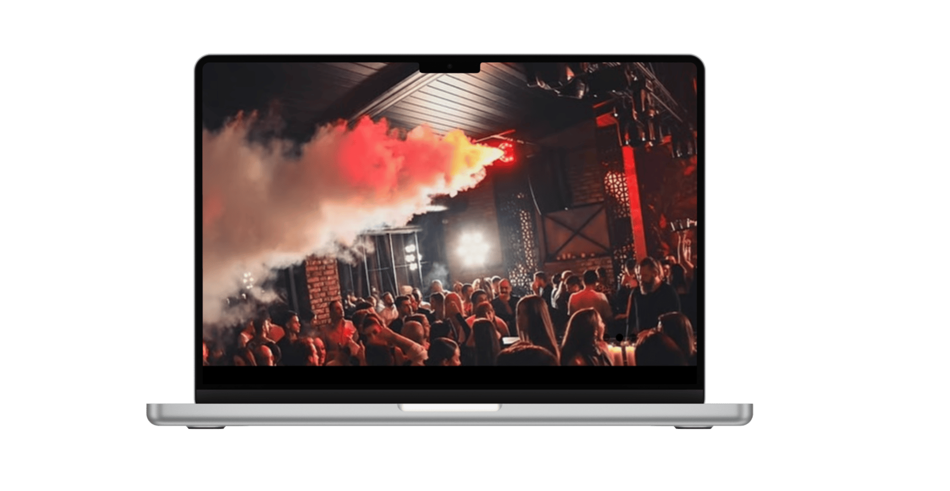
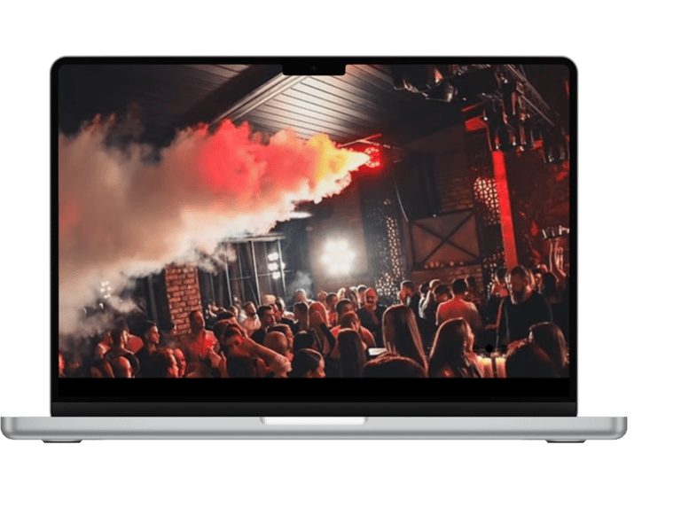
Website design for Intermezzo
The Intermezzo website captures the energy and style of Skopje’s luxury nightclub scene. Sleek, modern design meets dynamic photography of the venue, cocktails, and events, with subtle animations and hover effects adding movement and excitement. Dark, moody tones with vibrant accents reflect the club’s exclusive, upscale vibe, creating a digital experience that feels as lively and immersive as the nightlife itself.
aleksandratasevskabiz@gmail.com